# 6427-31 / nocturnal • common places ~ the night is filled with shadows

fiddling while house burns ~ fireman taking a picture (embiggenable)
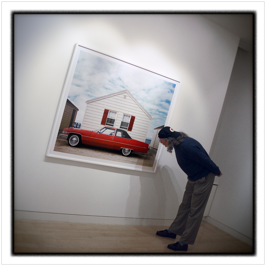
(embiggenable)

(embiggenable)

(embiggenable)

(embiggenable)

SPOILER ALERT: well, not really. However, this entry will divulge a key part of my intro for the Philosophy of Modern Pictures book/project. To wit….after a lot of thought and research, I have come to the conclusion that the more things change, the more they remain the same, or, as David Byrne sang, same as it ever was.

Ever since the introduction of the digital picture making age, there has been considerable caterwauling and lamentation-don’t get me started with the monochrome crowd who can tell you the day the music BW died-re: the landmark, tradition changing, revolution about how picture making has change. To which I call, BS.

A far as I can see, sure, sure, light sensitive picture making substrates has changed from film to digital, print making has changed from the wet darkroom to the desktop / software ”darkroom”, and making good pictures, technically wise, has gotten easier BUT, paraphrasing Robert Adams…"

“…the only thing that is new in art [insert “photography’ here] is the example: the message [insert “photographs” here] is are, broadly speaking, the same-coherence, form, meaning.”

In other words, the medium and its apparatus are still inexorably / intrinsically a cohort of the real. That is, we all continue to make pictures of real-world referents-you know, people, places, things. Sure, sure, the tools have changed, but the “message” remains the same.

Of course, one could argue, what about all that special effects / filters / digital constructions stuff? Answer: one of the earliest “movements” in photography was Pictorialism and continued through the ages with Jerry Uelsmann as one of many prime examples. However, virtually all of their works, aka: acts-of-the-imagination pictures, start with pictures of referents snatched from the real world.

iMo, and that of many others, those making acts-of-the-imagination pictures are not photographers. In point of fact, they are artists-often referred to as photo artists-who employ the tools of the medium and it apparatus to create images, not photographs. And, there ain’t nothin’ new ’bout that activity.

So, from my point of view (literally-how I see the world-figuratively-my picture making vision), everything is the same as it ever was.

# 5778-86 / nocturnal•noir ~ other worldly?

(embiggenable) µ4/3

(embiggenable) µ4/3

(embiggenable) µ4/3

(embiggenable) µ4/3

WHILE I HAVE NEVER ACTUALLY CONCENTRATED UPON the making of pictures of the dark side of life-that is, the low-light side, not the negative, troubled, or antagonistic part of life-I find that, nevertheless, I have a collection of approximately 100+ dark side / low light pictures (thank you, discursive promiscuity).

In any event, I must admit that I am drawn to nocturnal/noir-type pictures in a manner that I do not fully understand. Although, it would not be a stretch to associate my fascination/attraction to/with nocturnal/noir pictures with the "normal" human condition-not a phobia (nyctophobia)-of fear of the dark. An emotional state which conjures up ghosts, monsters, strange noises, apprehension of the unknown, or, even a feeling of detachment from self or feeling "unreal". Or, simply written, other worldly. I would even go so far as to write that, when viewing my dark side pictures (and those made by others), those feelings are amplified relative to what I experience in situ.

That written, to my eye and sensibilities, my nocturnal/noir pictures are quite different fom my "normal" work inasmuch as my "normal" pictures tend to be, on their surface, a rather "cool"(non-emotional), detail-oriented observation of real world referents. Whereas my nocturnal/noir pictures are slim on detailed referents and heavily oriented toward an appeal toward the emotional side of the street. That being the case, what both picture making M.O.s have in common is, iMo, that both approaches to picture making tend to instigate the same reaction, re: what is going on here? / what is this picture "about"?

Dispite instigating a similar question, each body of work tends to direct a viewer's answer to that question in a different direction. My "normal" work is biased toward the recognition and application of the principles of art and the nature of beauty, i.e. a somewhat reasoned appeal to the intellect (albeit not without an emotional aspect). My nocturnal/noir work is biased toward an immediate assualt upon the emotional senses (albeit not without the recognition and application of the principles of art).

Case in point:

Judge for yourself. What is going on in these pictures?

PS I am not afraid of the dark.

# 5648-51 / noir•tangles•civilized ku ~ feeling it, not thinking it

(embiggenable) • µ4/3

(embiggenable) • iPhone

(embiggenable) • µ4/3

(embiggenable) • µ4/3

IN A COUPLE ENTRIES BACK, some of these pictures are just like the others, I mentioned the oft-heard lament that "everything that can be photographed has been photographed".

In doing so, I qualified that idea by writing that, in a general sense, there is some truth to that concept. However, what I failed to write was that, in a specific sense, that idea is totally absurd inasmuch as the planet and everything on it has a nearly incomprehensible amount of stuff-i.e., specific referents-that have never been photographed.

What might be more accurate to write is that many (most?) picturing genres have been worked to near death. And most of that work reaches the level of repetitive, carbon-copy cliche (as dictated by the "time-honored" picturing conventions of a given genre)-what Robert Adams called "the ten thousandth camera-club imitation of a picture by Ansel Adams". The net result is to create the impression, within the confines a given picture making genre, that, indeed, everything that can be photographed has been photographed.

That written, one of my favorite sites, Don't Take Pictures, has a semi-regular feature, Rule Breakers, that begins with the premise...

"I never want to see another picture of ________.” and, goes on with Industry Veterans who "share their pet peeves on themes in contemporary photography... [and] present their “rule” along with five photographs that break the rule in an effort to show that great work is the exception to the rule."

This exercise, re: Rule Breakers, is pretty much a rehash of the (once again) "time-honored" admonition that, even if everthing that can be pictured has already been pictured, one can create something beyond the cliche by making picures with one's own personal "take", the vision thing, added to the mix. That is, to stop making pictures of what one has been told is a good picture, and start making pictures of what one sees.

That's good advice but, unfortunately, it does seems that most picture makers "see" in cliches. They are unable to let of what they have been told is a good picture or what constitutes a suitable referent for picture making. And, most often their attempt to find their vision is to layer on flashy techniques and gobs of art sauce. iMo, that's cuz-and I know I'm treading on the third rail here-true vision, unlike technique, can not be taught*.

True vision can only be "discovered" within oneself, most often by an extensive course of trial and error. An undertaking characterized by continuous or natural development based upon the belief that innate ideas exist. Or, in other words, one's vision is kinda like a hidden, amorphous pre-exisitng condition which needs to be coaxed out of the shadows. The purpose of which is to recognize it / "feel" it, not to necessarily fully understand it, as the nativistic** / intuitive structual backbone of one's vision.

AN ASIDE: Consider this aside a warning or, alternately, an invitation. There is more to follow, re: the vision thing...how to "find" it, how to understand it and how to use it. END OF ASIDE

* "Self-education, only, produces expression of self." ~ Robert Henri / from his book, The Art Spirit, the only book one needs to read in one's quest to find one's vision and become a maker of good pictures.
** in the field of philosophy, the doctrine that the mind produces ideas that are not derived from external sources.

civilized ku # 3553-55 / ku # 1451-52 ~ I'm a control freak

noir # 1 ~ (embiggenable) • µ4/3

noir # 2 ~ (embiggenable) • µ4/3

noir # 3~ (embiggenable) • µ4/3

infrared-ish # 1 ~ (embiggenable) • µ4/3

infrared-ish # 2 ~ (embiggenable) • µ4/3

BW PICTURE MAKING HAS NEVER BEEN MY "thing". Although, back in the analog days, I was known for making very high quality BW pictures / prints which featured detailed "inky" dark tones and delicatedly detailed highlight tones. That written, most of those pictures were made for commercial assignments as opposed to personal work.

When I entered the digital picture making world, by the very nature of the digital medium there was no way to make, directly in-camera, a BW image. And, since I do not "see" the world, then or now, in tones of black/white/gray, that transition to digital was the end of BW picture making for me.

CAVEAT: were I to return to the making of BW pictures / prints, I would return to the world of analog, aka: film-based picture making, picture making and print making. And, I must admit, the idea of hand-processing film and making prints in a darkroom, as opposed to sitting in front of a monitor, has a definite alure. END OF CAVEAT

In any event, the pictures in this entry are BW conversions made from original color image files. They were made over the past couple years in response to requests for submissions to juried BW photo exhibitions. The group displayed here has been pulled out of hiding for the same purpose.

FYI, when I make a color>BW conversion, I do so, not by simply converting to grayscale, but rather by using the IMAGE > ADJUSTMENTS > CHANNEL MIXER technique together with some subsequent Photoshop adjustments (usually local as opposed to global adjustments). This technique allows for incredible control over the conversion process, control far beyond anything possible in the BW analog world.

That "ultimate" control (both with bw and color), which I have totally embraced since my entrance in the digital domain, is what keeps me from returning to the good ol' analog days of yesteryear ... I have no doubt that I would be very frustrated by the limited amount of control, technique wise, I would have in the analog processing and print making world as opposed to what I have grown used to in the digital world.

FYI # 2, the noir pictures, converted from existing color pictures, in this entry were created for submission to a "noir" themed exhibition. The infrared-ish pictures were created during a brief fling-although, it emerges now and again-I had with making pictures, in-camera, which could be converted to a BW infrared-ish look.

civilized ku # 3608-3611 ~ looking good

(embiggenable) • iPhone

(embiggenable) • iPhone

(embiggenable) • iPhone

(embiggenable) • iPhone

In a comment left on my entry, good things can come in small packages, Clifford Gwinn wrote:

Wow, didn’t know those files could go that large.

my response: To be honest, I didn't know that either until I discovered the Preserved Details option in the PS IMAGE SIZE tool. That written, I had been printing iPhone pictures up to 16x16 inches with great results. However, I'll let you in on a secret ...

In my personal picture making work, all of my influences are derived from the so-called Fine Art photography world. In particular, notions about print size and related "quality". Back in the 70s Jeff Wall was spreading the word that, to be considered the equivalent of painting, photographs needed to be presented in a large scale. In Wall's case that meant print sizes of up to 30 feet in length and, typically, 18-20 feet in length. I saw his retrospective at MOMA.

Then there is Edward Burtynsky who photographs sweeping scale landscapes and typically prints up to 50-64 inches (length). I saw his Quarries gallery exhibit. Andreas Gursky, who prints in the 12 ft+ range is another go-big guy. And the list goes on and on and, over the years (actually, decades), I have viewed a significant number of go-big fine art photography prints.

All of those go-big prints had one characteristic in common. That is that they were all enlarged to a size well beyond that that would be proscribed, considering the originating file format, for displaying (up close) picture sharpness / resolution. The other thing they had in common was that, when viewed from a "proper" distance, they were all wonderfully impressive.

What I learned from that experieince is that, no one-to include photographers, curators, buyers, et al-in the Fine Art Photography World gives a rat's ass about "sharpness". At least so, not as it is currently defined in the digital picture making era. iMo, that's because I have yet to see a viewer (in a Fine Art gallery or museum), to use a modern term, "pixeling peeping" or, perhaps "grain/sharpness peeping".

me pretending to peep a Meyerowitz print

me pretending to peep a Meyerowitz print

In the Art World, the prevailing pardigm, re: viewing a photographic print, is to view a print from a distance which allows the viewer to see the print in its entirety in order to experience the look and feel of the picture maker's intent in its totality. Or, to write it another way, the "beauty" is not in the details, it's in the whole.

So, for my eye and sensibilities, when I write that I am getting great results from printing iPhone pictures at large size, one should realize that I am not after state-of-the-art sharpness / resolution. That written, it is accurate to write that, nevertheless, those prints do display very good sharpness / resolution.

Glifford also asked:

...what phone app do you use and do you sharpen your files for print (liquid)?

For most of my picture making, I use the box-stock iPhone camera module and its associated software. For my file processing on the iPhone / iPad I use Snapseed. For low-light picture making, I have been experimenting-see pictures in this entry-with various camera apps to find one which creates better low-light files than the iPhone software. To date, I am using VSCO which does a good job of it.

File sharpening-most often low to moderate-is performed on a case by case basis. It should be noted that, when I do apply sharpening, it is always done after I have converted the file to LAB colorspace where the sharpening is applied only to the grayscale channel, not to the the color channels. This technique allows for a higher level of sharpening without creating the sharpening artifacts that would be created at the same level sharpening in RGB colorspace. After sharpening the file is converted back to RGB color space.