civilized ku # 3623 ~ to bloviate

(embiggenable) • iPhone

Tyler, (the Profligatographer) wrote (in part):
My goodness. For someone who believes that images require no words (and I agree), you certainly use a lot of them. Plus you print them in smaller, san-serif typeface—in gray, no less—making reading far less pleasurable. So, I've stopped reading what you are writing and only look at the images.

Re: typeface - unfortunately, Squarespace does not have-I wish they did-an easy to use drop-down menu for typeface or type size selection (although the typeface is presented in black). I can add html code-albeit to each and every entry I make (time consuming)-to use a serif typeface. However, that code is not recognized in html 5 which may create a problem for some users. So, I am sticking to what works for most users.

Re: use a lot of words - it's no coincidence that in my talk radio days I was known as "Blovius". That aside, Currently this blog is averaging 1,250 unique visitors and 3,600 pages views a month. I have no idea whether visitors are just looking at pictures, reading the words or both. Be that as it may, yours is the first mention about readability (typeface wise).

Should you decide to read any the words on this blog, most browers will allow the user to enlarge what is displayed-words and pictures-in the browser window.

In my next entry, I'll have a response to part II of your comment:

If you are willing to accept the output of telephone cameras, if it's good enough for you, so be it—for you. But at the other end, do you view your work and those of others in the same way? According to you, you seem to prefer (by far) to view prints on the wall, or in books. Where does that leave us, I wonder.

civilized ku # 3621-22 ~ how to read a photograph

doorway ~ E4th Street / NYC (embiggenable) • iPhone

There are a number of books out there which have the title of How to Read a Photograph or a variation thereof. I have considered writing such a book but I don't think there would be many buyers for a 1 page book. It would be a 1 page book because all I have to say/write on the topic is ....

STOP. Don't even try to read a photograph. It's not a novel / newspaper / periodical / note to self or any other thing which depends on the use of words to be understood. Rather, it is a thing to be looked at. End of story.

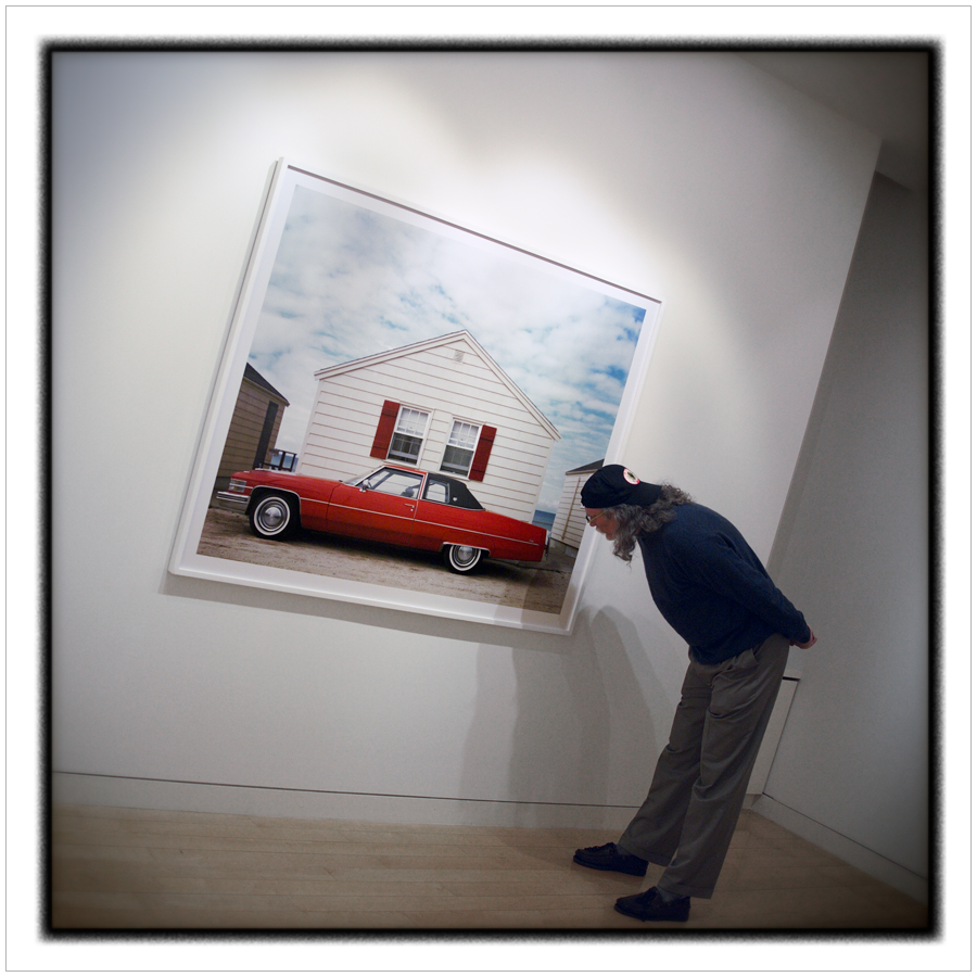
My wife has a good friend who could be said to have-iMo, quite accurately-a very limited artistic sensibility. I would be surprised, no...make that stunned, to learn that, in her 50+ years on the planet, she had even once visited an art museum. However, on the plus side, she did buy one of my pictures to hang in her house.

That written, iMo, she has a near perfect manner in which she views a picture or, at least, my pictures. In a nutshell, when viewing one of my pictures, it goes something like this .... "Why did you take a picture of that?", followed by, "I don't know why, but I like it." And, on some occasions, she sums it all up by saying, "You're so weird."

Her viewing experience is exactly the manner in which I hope my pictures are viewed.

In other words, my desire is that a viewer not get too hung up on the specificity of the depicted referent(s) inasmuch as I picture things, not for what they are, but for how I feel when I see them. In a very real sense, the depicted referent(s) in my pictures is "just" a signifier-a sign's physical form (such as a sound, printed word, or image) as distinct from its meaning-which is used to convey a feeling, conscious or not, about my eye and sensibilities. Or, in other words, how I feel, at times, when I see things around me.

And, that is what my wife's friend "gets" when she looks at some of my pictures .... a feeling which she can't consciously explain but which I think is her subconscious artistic sensibilities trying to get out.

I believe that when she says, "I like it.", she is saying, on conscious level, that she likes the picture. However, I also believe that she is liking, on subconscious level, the feeling(s) she is experiencing while looking at the picture.

When I look at a picture, I don't often specifically care about what is depicted (other than when viewing family, friends, travel, et al "snapshots"). What I am "looking" for is a feeling a good picture can convey / incite independent of what is depicted. A feeling that is more than the wow-like sensationalism found in pictures of dramatic / color saturated referents et al. A feeling that is much more "quiet" and intimate than that. A feeling that I am feeling what the picture maker was feeling at the moment the picture was made.

Or, simply put, look and feel, no reading necessary.

civilized ku # 3619-20 ~ a certain genius

parking lot booth ~ WIldwood, NJ (embiggenable) • iPhone

hotel hall~ Rayham, Mass. (embiggenable) • iPhone

In a recent post I wrote about a book of polaroid pictures, LEGACY of LIGHT, that I recently acquired. In the preface of that book, Constance Sullivan, the then (c.1987) Publications and Exhibitions Director of Polaroid Corporation, wrote (in part):

The very hardest thing about instant photography as a serious mode is probably how easy it is. Where so much effect comes effortlessly, the narrow range of choice that remains must be brought to white heat. Like abstraction in painting and "free verse" in poetry, instant photography is so simple that only those with a certain genius can really master it.

In this entry, it is my intent to apply much of that excerpt to iPhone picture making. But first, a few words about the statement itself....

re: "how easy it is" / "so simple". iMo, making pictures has been "easy" ever since the advent of roll film. As KODAK advertised at that time, You push the button, we do the rest. I would also offer an opinion that the making of "serious" pictures has always been "easy" (with the exception of those who print with arcane / legacy materials) inasmuch as those with a "certain genius" are "just" following their innate vision (their way of seeing) and making pictures of what they "see".

re: "narrow range of choice", Again iMo and assuming she is referring to the limited camera setting options on Polaroid cameras, she is correct. However, at the time she is also not correct inasmuch as, it seems to me, that most of the Polaroid pictures in the book were made with "real" cameras (medium format roll film and 4x5/8x10 view cameras) using professional Polaroid products-aka: sheet films-with Polaroid film backs. In that case, all of the normal camera choices were available.

However, she is correct, re: once any Polaroid film is processed there are no processing choices. At that point, what you see is what you get. There were a few exceptions such as the manipulation SX-70 film emulsion using pointed objects or, as some professional Polaroid film users (myself included) did, making emulsion transfer prints or simiar techniques.

All of that written, on to my point, re: adapting Sullivan's statement to iPhone (or similar)....

Most certainly, making pictures with the iPhone is very simple/easy. There are only a few camera controls, primarily selecting focus and adjusting exposure. Some camera apps give the user many "real" camera-like controls, but I rarely use them because I like to keep it simple. Much like the original KODAK cameras, I press (touch) the button and, in this case, the machine does the rest.

Unlike Polaroid picture making, the digital files created on the iPhone have some rather serious processing options with the use of one of many good processing apps. I use Snapseed to do "normal" processing on my files. I do not use any of the Effects options. Many do.

In fact, in my perusal of online photo sites-sites like Instagram which is used by a host of "serious" picture makers-it seems that the majority of iPhone (or similar) users use lots of effects apps to create their pictures. Whether this is so due to lack of a real "certain genius" or the use of effects as a integral part of their vision OR, more likely, merely as means of getting "likes" is hard to determine (for me).

That written, re: the use of an iPhone or "real" camera (no matter the lack or abudance of choices), to my eye and sensibilities, the best pictures are those made by picture makers with a "certain genius" which enables them to see things and picture and present them in a manner which transcends, with a sense of visual erotics (not sexual-read Susan Sontag's Against Interpretation essay), the literal specificity of a their depicted referent(s).

Civilized ku # 3618 ~ don’t make promises you can’t keep

entrance to hockey locker rooms ~ (embiggenable) • iPhone

A few weeks back, after returning home from almost 2 months of a number of trips, the wife and I were happy that we wouldn’t be traveling again for at least a month. In fact we promised yourselves something to that effect.

That hasn’t worked out. After an unscheduled trip to NYC last weekend for a Kinderschule graduation and helping my best friend move (to my Adirondack neighborhood), this weekend I find myself just outside of Boston with my grandson Hugo for an unscheduled hockey tournament.

I woke up Wednesday morning to find an last minute email request for Hugo to play for Team New England, a team he has planned for in the past. The request was fortuitous inasmuch as he really needed a “warm up” tournament to get his hockey legs back for his participation on Team Pittsburgh in the Hockey Night in Boston showcase tournament / event (2 weeks from now). That event is scout intensive - scouts and coaches from Junior, prep school and collage teams will be in attendance.

Next weekend, in between this weekend and the next tournament, I have to travel to the central Adirondacks to mount my solo exhibition pictures and give a talk at the opening reception. And it doesn’t stop there, there is still more way from home travel to come.

civilized ku # 3614-17 ~ moving on up

NYC ~ (embiggenable) • iPhone

NYC ~ (embiggenable) • iPhone

NYC ~ (embiggenable) • iPhone

NYC ~ (embiggenable) • iPhone

Went to NYC over the weekend to assist my best friend with his move up to my neighborhood in the Adirondacks. Didn't intend to make much in the way of pictures but ended up with enough good pictures to make a photo book.

I also had a chance to visit my favor book store, MAST BOOKS. It is a small store front place which sells only used books. Books that are art oriented and somewhat eclectic. It seems that every time I visit the store I always leave with a book or two selected from their photography offerings. This visit was no exception to that rule.

Consequently, the latest addition to my ever-expanding collection of photography books is LEGACY OF LIGHT 205 Polaroid Photographs from 58 Distinguished American Photographers, published in 1987. The hard-bound book is 12x10 inches with very high quality reproduction - not surprising inasmuch as the book is published by ALFRED A. KNOPF.

The pictures are very interesting both visually and "conceptually", representing what is labeled in the introduction as "authentic vision". The photographers represented are those who were icons of that era. No surprise inasmuch as Polaroid Corp. had a program which recruited art world name brand picture makers to make pictures with Polaroid cameras / films - cameras ranging from the earliest shoot-and-peel film cameras up to 8x10 instant films (used in an 8x10 view camera) and their 20x24 inch studio camera, of which there were only a very few. The bbok was a great find.

If one is in NYC, I would highly recommend a visit to MAST BOOKS with the caveat that you won't be overwhelmed with the inventory. At any given time there might only be 40-45 ever-changing photography titles.

civilized ku # 3613 / adirondack snapshot project # 396 ~ risky business

unused lamps on unused radiator ~ (embiggenable) iPhone

another roadside attraction ~ (embiggenable) • Canon 4mp G3

Nearly every morning as I sit at our kitchen island counter sipping coffee and having a breakfast-like nibble, I steer my iPad to my "regular" rota of a handful of photo sites.

One of my regular stops along the way is the site, DON'T TAKE PICTURES. The site is dedicated to showcasing pictures which are, for the most part, straight photography. That written, the site has a regular feature, RULE BREAKERS, along the theme of ...

..."I never want to see another picture of ________.” Industry veterans share their pet peeves on themes in contemporary photography. In this series they present their “rule” along with five photographs that break the rule in an effort to show that great work is the exception to the rule."

The site is one of my "regulars" simply because I am in constant search of pictures which "break the rules". Or, as Elliott Erwitt has written:

"To me, photography is an art of observation. It’s about finding something interesting in an ordinary place… I’ve found it has little to do with the things you see and everything to do with the way you see them."

Or, as Brooks Jensen wrote

"Most people see good pictures and photograph bad ones. Real photography begins when we let go of what we have been told is a good photograph and start photographing what we see"

My morning rota is just a handful of sites because I find that there are-or seem to be-precious few picture makers out there who are "breaking the rules" / "photographing what they see". Maybe I'm not trying hard enough to find them but it seems that even most "serious" picture makers just can't break out of the box.

I have my suspicion as to why that is ... the lack of imagination / confidence to let go of the rules. I think of it as a kinda pandering to the masses or what could be labeled as the conventional taste(s) of the masses. After all, if one is looking for lots of "likes", playing it safe is the way to go.

civilized ku # 3612 / made vs found ~ no direction home at this point

windows and a door ~ New Orleans, LA. (embiggenable) • iPhone

found / made ~ (embiggenable) • iPhone

In my 40 years career as a pro photog, 99.99% of the pictures I made were "made" pictures. That is, pictures which were made-to-order to meet client needs / demands. Every element of those pictures was controlled by me .... placement / arrangement of product, people (models), props within the frame plus complete control of the lighting thereof and scene selection (when on location).

In my personal "serious" picture making, 99.99% of my pictures are so-called straight, aka: "found", pictures. That is, while I do control the selection of my referent(s) and the manner in which I arrange it/them within my frame, I picture the world around me-places, things, people-as I see and "find" them.

Both my "made" and "found" picturing activities have provided, amongst other things, a great deal of art(istic) satisfaction/ pleasure. Over the past 15 years, virtually all of picturing has been of the "found" variety. However, of late, I am starting to feel the itch (need?) to pursue creating pictures of the "made" variety. That is, non-commercial (client-driven) "made" pictures which, in their making, I control what-things / people-is in the picture.

The issue that I am dealing with in order to scratch that itch is that the possibilities for creating "made" pictures seems endless. Still life pictures of things-in studio or on location leads to the question of what things? And, to what end / intent? People pictures present the same issues ... studio / location and which people and to what end / intent?

iMo, it seems that the real issue is not still life / people pictures on location or in the studio. Rather, it is the to what end or intent that matters most inasmuch as, if one is going to create "made" pictures, it is the to what end / intent where the starting point lies.

While pondering that issue, I just keep on creating "found" pictures.

civilized ku # 3608-3611 ~ looking good

(embiggenable) • iPhone

(embiggenable) • iPhone

(embiggenable) • iPhone

(embiggenable) • iPhone

In a comment left on my entry, good things can come in small packages, Clifford Gwinn wrote:

Wow, didn’t know those files could go that large.

my response: To be honest, I didn't know that either until I discovered the Preserved Details option in the PS IMAGE SIZE tool. That written, I had been printing iPhone pictures up to 16x16 inches with great results. However, I'll let you in on a secret ...

In my personal picture making work, all of my influences are derived from the so-called Fine Art photography world. In particular, notions about print size and related "quality". Back in the 70s Jeff Wall was spreading the word that, to be considered the equivalent of painting, photographs needed to be presented in a large scale. In Wall's case that meant print sizes of up to 30 feet in length and, typically, 18-20 feet in length. I saw his retrospective at MOMA.

Then there is Edward Burtynsky who photographs sweeping scale landscapes and typically prints up to 50-64 inches (length). I saw his Quarries gallery exhibit. Andreas Gursky, who prints in the 12 ft+ range is another go-big guy. And the list goes on and on and, over the years (actually, decades), I have viewed a significant number of go-big fine art photography prints.

All of those go-big prints had one characteristic in common. That is that they were all enlarged to a size well beyond that that would be proscribed, considering the originating file format, for displaying (up close) picture sharpness / resolution. The other thing they had in common was that, when viewed from a "proper" distance, they were all wonderfully impressive.

What I learned from that experieince is that, no one-to include photographers, curators, buyers, et al-in the Fine Art Photography World gives a rat's ass about "sharpness". At least so, not as it is currently defined in the digital picture making era. iMo, that's because I have yet to see a viewer (in a Fine Art gallery or museum), to use a modern term, "pixeling peeping" or, perhaps "grain/sharpness peeping".

me pretending to peep a Meyerowitz print

me pretending to peep a Meyerowitz print

In the Art World, the prevailing pardigm, re: viewing a photographic print, is to view a print from a distance which allows the viewer to see the print in its entirety in order to experience the look and feel of the picture maker's intent in its totality. Or, to write it another way, the "beauty" is not in the details, it's in the whole.

So, for my eye and sensibilities, when I write that I am getting great results from printing iPhone pictures at large size, one should realize that I am not after state-of-the-art sharpness / resolution. That written, it is accurate to write that, nevertheless, those prints do display very good sharpness / resolution.

Glifford also asked:

...what phone app do you use and do you sharpen your files for print (liquid)?

For most of my picture making, I use the box-stock iPhone camera module and its associated software. For my file processing on the iPhone / iPad I use Snapseed. For low-light picture making, I have been experimenting-see pictures in this entry-with various camera apps to find one which creates better low-light files than the iPhone software. To date, I am using VSCO which does a good job of it.

File sharpening-most often low to moderate-is performed on a case by case basis. It should be noted that, when I do apply sharpening, it is always done after I have converted the file to LAB colorspace where the sharpening is applied only to the grayscale channel, not to the the color channels. This technique allows for a higher level of sharpening without creating the sharpening artifacts that would be created at the same level sharpening in RGB colorspace. After sharpening the file is converted back to RGB color space.