no wonder the wife likes working from home ~ (embiggenable) • iPhone
(embiggenable) • iPhone
(embiggenable) • iPhone
THIS ENTRY MIGHT JUST BE AN EXERCISE in futility for some inasmuch as, if the included link is behind a pay-wall, my point will be somewhat incomplete. Nevertheless ....
... here is the link, A PORTRAIT IF AMERICA THAT STILL HAUNTS, DECADES LATER. In case you can not link to it, it is an article about Robert Frank's New Orleans Trolley picture.
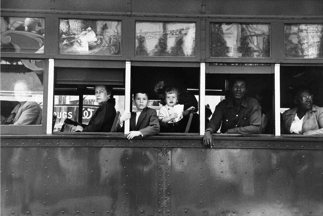
The article itself is a dissection, one might even write vivisection, of Frank's iconic-at least so in photography circles-photograph from his landmark work/book, The Americans. The author of the piece is Arthur Lubow, a journalist who writes mainly about culture and is the author of Diane Arbus: Portrait of a Photographer.
To be right up-front about it, iMo, I really dislike this article. However, to be fair, I do not dislike it any more or less than any other similar articles in which an author is seemingly engaged in trying to impress the reader with his/her insightful art knowledge. And, as should be obvious by my last entry, parts is just parts, I especially dislike it when an author, discussing / writing about a picture, rips a picture into distinct-from-the-whole separate "pieces".
In the article in question, the author actually uses other photographs and a painting to "explain" / add "meaning" to some of people depicted in the picture. I guess that is because they just can not be allowed to be themselves. Instead, they must be associated with other figures depicted in other art in order to be "understood".
And, writing of other art, the author picks apart individual elements in the photograph in order to describe one element as "a hallmark of the Minimalist art that would blossom in the ’60s", or another element as, "could easily be a Whistler painting", or yet anoter element as, "like something out of Abstract Expressionism".
Once again, as the author does with the depicted people, the things he describes with even more art references just can not be allowed to be eactly what they are. You know, things depicted and described as the camera sees them.
In what I consider the author's most egregious example of derivative artspeak lunacy (I will just give you the whole quote)....
"...the arabesque W of the Walgreens drugstore logo behind her ... is like an insignia that ranks her as an officer in the governing establishment, placing her just below the rider in front of her. Because that first decorative element, by strange coincidence, features a similar but larger swoop.
I could go on and on and fester on the emotions, mindset, and, in one case, even what the future holds for one person that the author confidently ascribes to the depicted people but, suffice it to write, the one thing that comes to my mind after reading this piece...
"Interpretation is the revenge of the intellect upon art ... Even more. It is the revenge of the intellect upon the world. To interpret is to impoverish, to deplete the world - in order to set up a shadow world of "meanings." ~ Susan Sontag
To be perfectly clear, here is my point .... Frank's picture is a very powerful and moving picture about what was and, in many cases and places, still is. That is to write, things as they are or have been.
An awareful and sentient viewer of this picture does not need any art-referential balderdash to be affected by the back-of-the-bus / separation-of-the-races mentality depicted and, by association, the brutality and human suffering engendered by it. All of which can "seen" and understood just by the simple act of looking at the picture.
Or, as James Agee wrote...
"For in the immediate world, everything is to be discerned, for him who can discern it, and centrally and simply, without a either dissection into science or digression into art, but with the whole of consciousness, seeking to perceive it as it stands: so that the aspect of a street in sunlight can roar in the heart of itself as a symphony, perhaps as no symphony can: and all of consciousness is shifted from the imagined, the revisive, to the effort to perceive simply the cruel radiance of what is.